Men’s Style
Our men’s style experts decipher dress codes, show you how to wear every piece in your wardrobe and showcase all the latest fashion trends. Consider this your manual for dressing better: classic yet contemporary; put together but effortlessly cool.
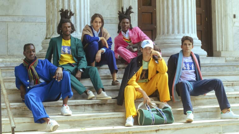
The 33 Most Sought-After Male Models In The World
30 Must-Have Modern Preppy Clothing Brands For Men
The 40 Hottest Streetwear Brands In The World Today

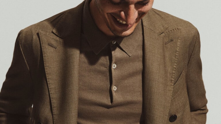
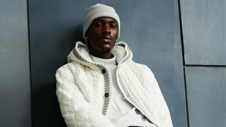
8 Stylish Winter Coats You Should Consider For 2024

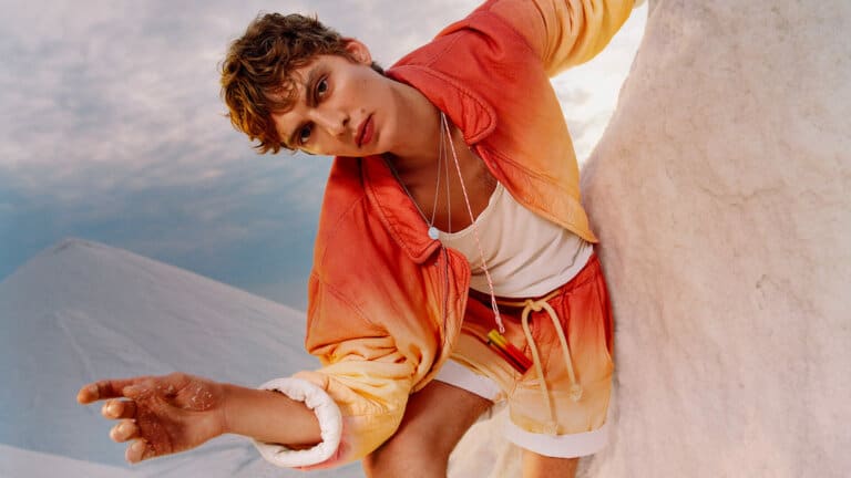
Ride The Wave: The 15 Coolest Surf Fashion Brands For Men

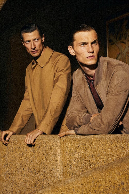
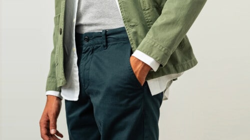
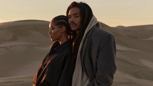
Men’s Fall Fashion Guide: The Key Pieces, Trends & Looks For 2024
What Colours To Wear With Navy/Blue Pants: 8 Foolproof Shirt Options
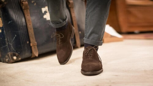
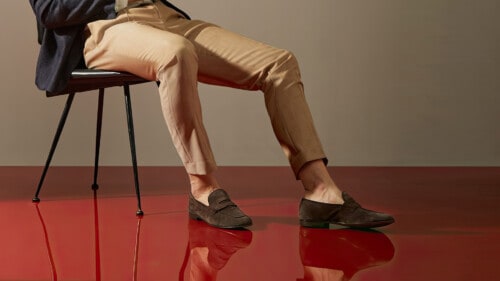
How To Wear Grey Pants With Brown Shoes: 5 Styles That Always Work

What Colour Pants To Wear With A Navy Blazer: 8 Foolproof Options
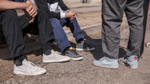
Heaven Is A Half Pipe: 18 Coolest Skate Clothing Brands For Men
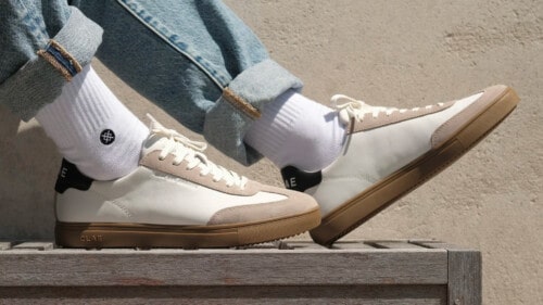
What Shoe Colours To Wear With Khaki Pants: 5 Foolproof Options
15 Los Angeles Clothing Brands All Stylish Men Should Know

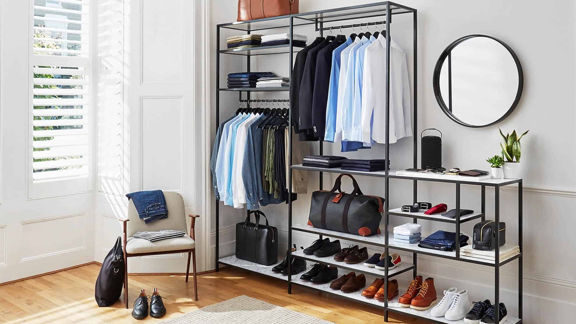
23 Affordable Men’s Clothing Brands Offering Superb Value For Money

19 Underground Clothing Brands Every Stylish Man Should Know
18 California Fashion Brands All Stylish Men Should Know
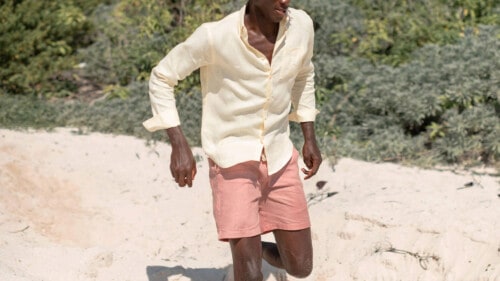
What Colours To Wear With Pink Shorts: 7 Foolproof Shirt Options

16 Spanish Fashion Brands All Stylish Men Should Know

What Colours To Wear With Green Shorts: 8 Foolproof Shirt Options
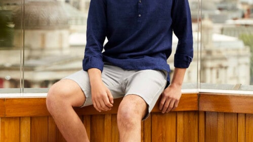
What Colours To Wear With Grey Shorts: 6 Foolproof Shirt Options

40 Old Money Fashion Brands To Get The Look In 2024